


How to Choose the Right Colors for Your Wedding Invitations
September 8, 2026
published on
filed under
Choosing your wedding colors can be surprisingly difficult.
You might have a Pinterest board filled with dusty blue bridesmaid dresses, olive green florals, butter yellow details, ivory linens, terracotta accents, champagne ribbon, and a dozen other shades that you absolutely love.
And somehow, you’re supposed to turn all of those colors into an invitation suite?
Here’s my biggest piece of advice: don’t.
Your wedding can have a beautiful, layered color palette with lots of different shades working together. But your invitation suite is a much smaller, more confined space. Trying to squeeze every wedding color onto a few pieces of paper can quickly make your invitations feel busy rather than cohesive.
Instead, think of your invitation suite as an edited version of your wedding’s overall aesthetic.
Here are a few things I recommend when choosing your invitation colors.
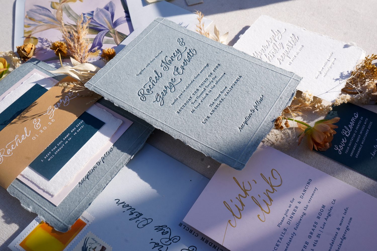
1. your wedding palette ≠ your invitation palette
Your wedding day has a lot of room for color.
You have florals, bridesmaid dresses, suits, linens, candles, tableware, signage, your venue, and countless little details all contributing to the overall look. A larger palette can work beautifully when those colors are distributed throughout a large space.
Your invitation suite is different.
You’re working with an invitation, a few enclosure cards, envelopes, and perhaps some additional details like a belly band, ribbon, wax seal, or envelope liner. There simply isn’t as much visual real estate.
That’s why I generally recommend narrowing your invitation palette down to three or four colors.
You don’t need to represent every color from your wedding day. Choose the primary shades that best communicate the overall feeling you want your guests to have.
Think of it as the highlight reel of your wedding palette—not the entire thing.
2. start with a mood board—not a color palette
Before you start picking exact shades, create a mood board.
And don’t limit yourself to images of wedding invitations. Add anything that captures the feeling you’re trying to create: your venue, florals, fashion, architecture, artwork, interiors, textures, fabrics, tablescapes, or even completely unrelated images that simply feel like your wedding.
A mood board is much more useful than a list of color names because it gives your stationer context.
“Green, blue, and pink” can mean a thousand different things.
A collection of images showing deep moss, faded blue linen, soft blush florals, old stone, and warm ivory tells me so much more about the wedding you’re envisioning.
It also gives all of your vendors a shared visual reference. Your florist, planner, stationer, baker, and photographer can all use that same mood board as a North Star when making design decisions.
P.S. I made a free Wedding Mood Board Kit to make this part easier. You can find that here.
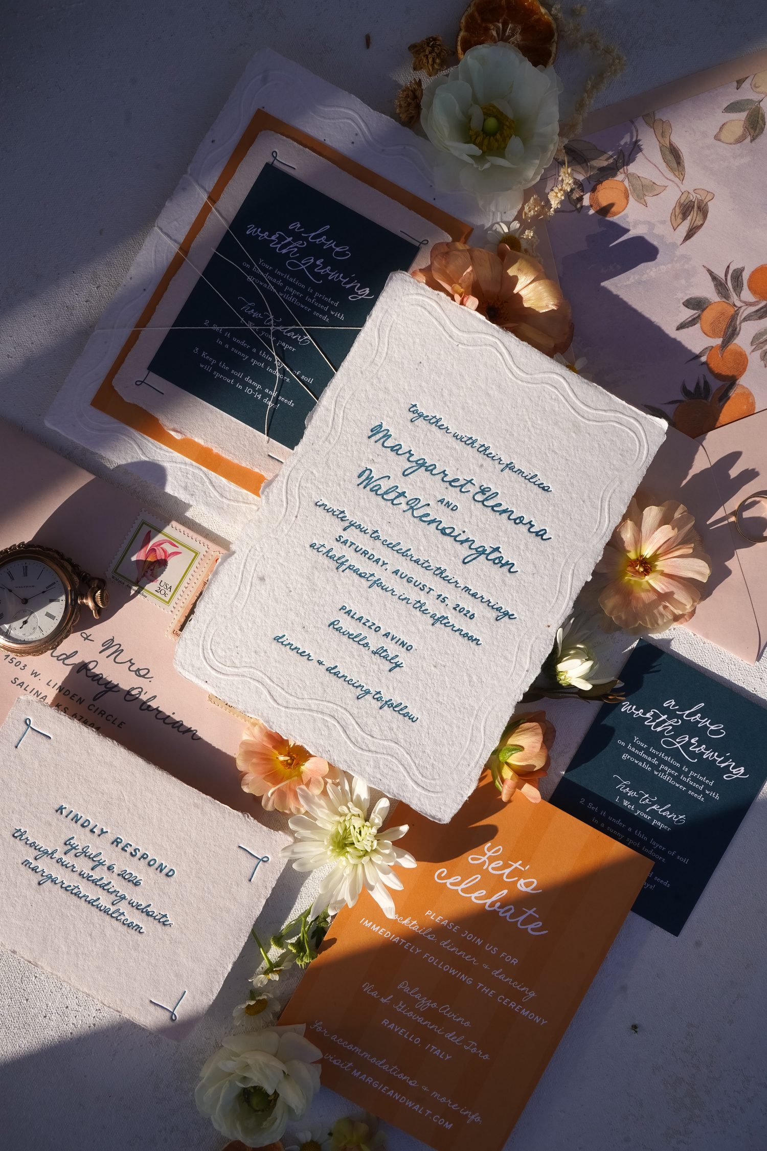
3. edit your colors down to four or five
This is probably the most important tip in this entire post.
When it comes to invitations, less really is more.
If your wedding palette has seven or eight colors, that’s totally fine. But I wouldn’t necessarily try to use all seven or eight in your invitation suite.
Instead, choose a few key players.
You might have:
- One primary color
- One secondary color
- One accent color
- One neutral
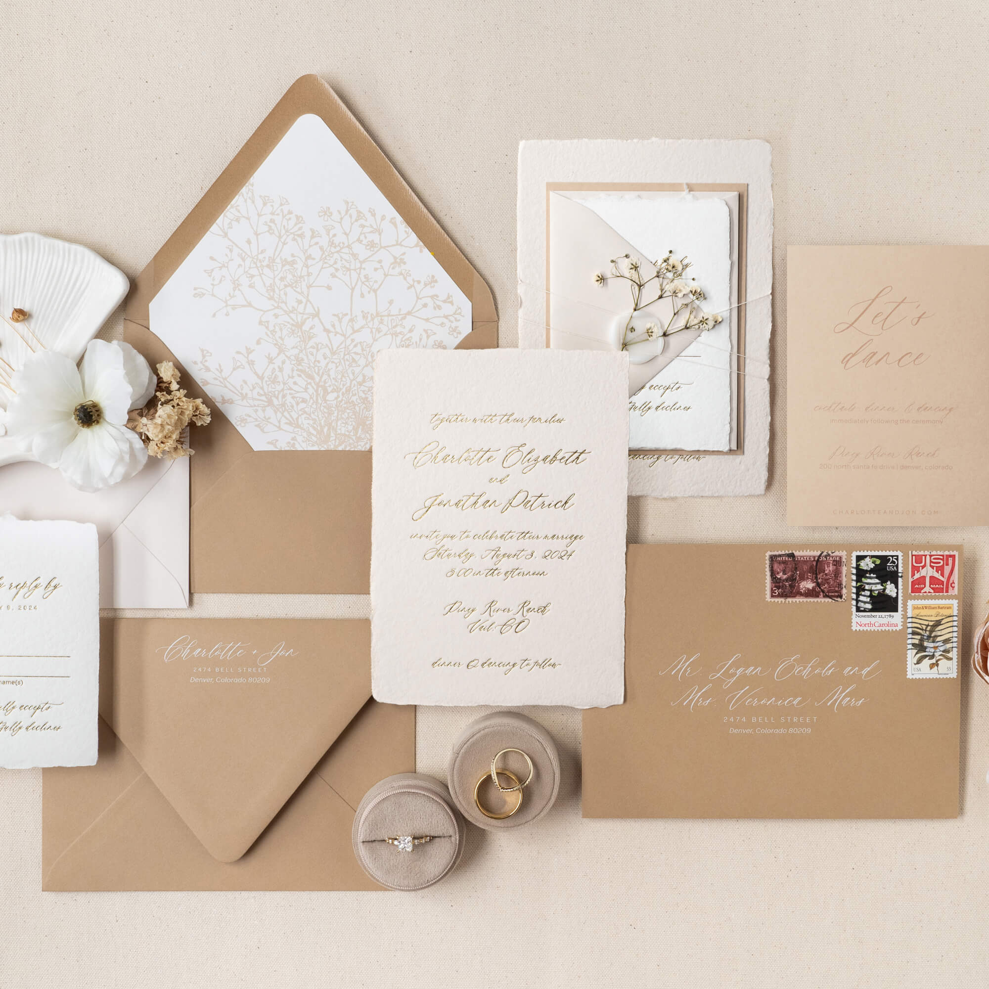
And remember that your neutral absolutely counts as part of the visual palette. Warm ivory, champagne, taupe, soft gray, or even a natural paper tone can give your other colors somewhere to breathe.
You can also create a lot of visual interest within a limited palette by using different materials. An olive green ink, for example, might appear alongside an olive envelope liner and a softer sage paper without introducing an entirely new color.
The goal isn’t to make your invitations boring.
It’s to give every color a reason to be there.
4. let your stationer guide you
You do not need to arrive at your stationer’s studio with your envelope color, text color, wax seal color, and paper color already decided.
In fact, I often think the best invitation designs happen when couples bring me their inspiration and then give me some room to interpret it.
Your stationer works with paper, ink, envelopes, printing techniques, and color combinations all day long. We know which envelope colors are beautiful together, which shades have enough contrast to be readable, and which combinations create the feeling you’re after.
So instead of saying:
“I need sage green ink, a blush envelope, an ivory liner, and a champagne ribbon.”
Try sending your mood board and saying:
“This is the feeling we’re going for. Can you help us choose the colors?”
You can always make adjustments from there.
But giving your stationer the freedom to use their expertise can often result in a much more cohesive suite than trying to specify every single detail yourself.
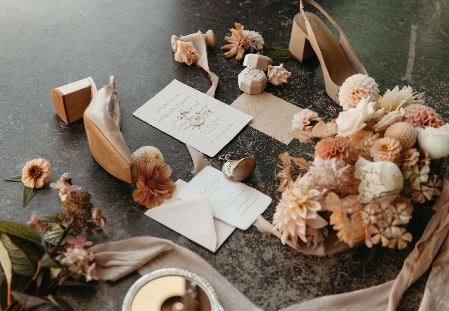
5. repeat colors throughout the suite
One of my favorite little rules when designing a suite is:
Don’t let a color appear only once if you can help it.
If you have a beautiful muted green used for the text on your main invitation, look for another opportunity to bring that green into the suite.
Maybe it’s the envelope liner.
Maybe it’s the RSVP envelope.
Maybe it’s a tiny detail on the information card.
It doesn’t have to be obvious. In fact, subtle repetition is often what makes a suite feel especially polished.
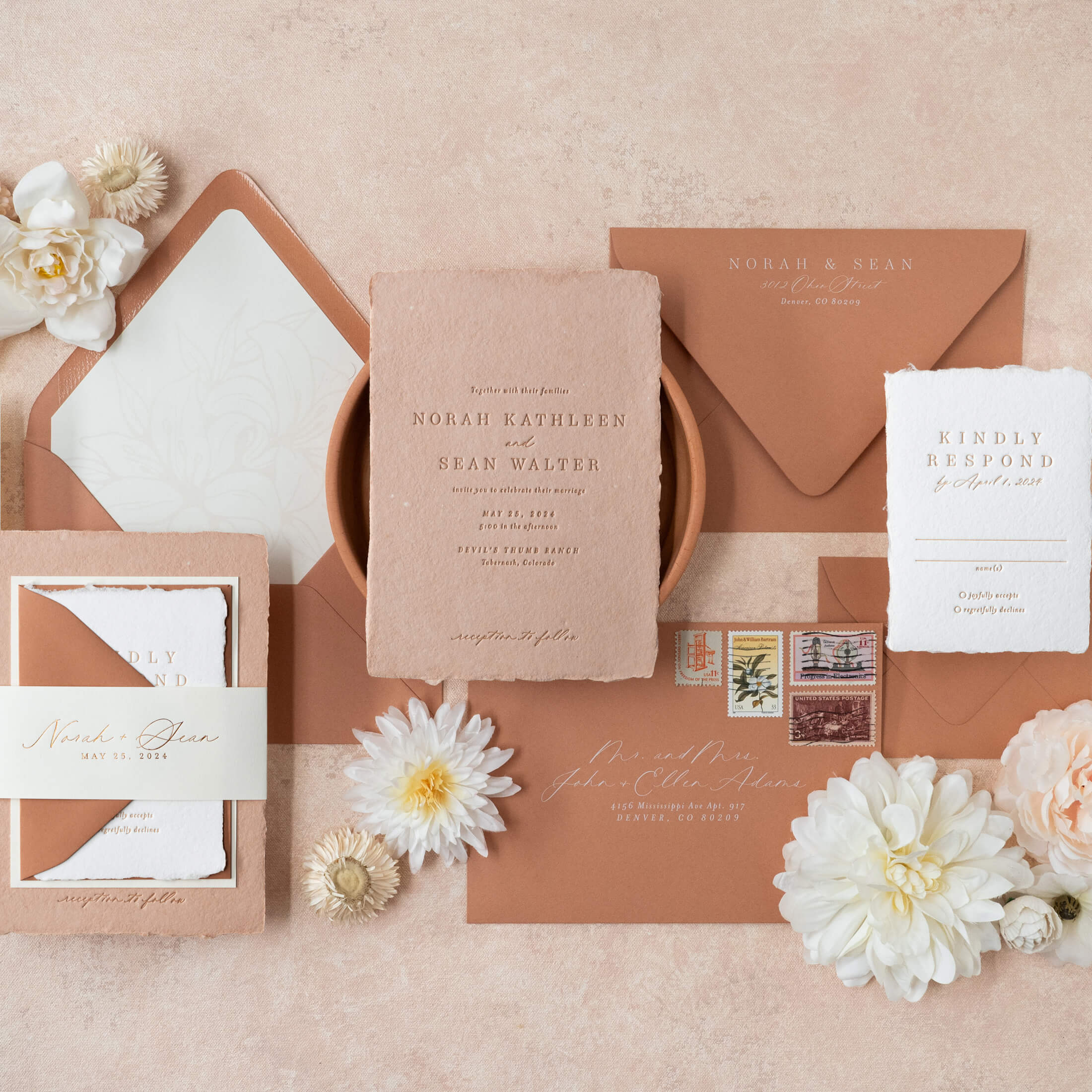
The same idea works with neutrals and materials, too. If you’re using a blush envelope, perhaps one of your enclosure cards is printed on blush paper. If you’re tying the suite with white ribbon, maybe white paper appears somewhere else.
These little echoes create visual connections between the pieces and make the entire suite feel like one intentional object rather than a collection of individual cards.
There are exceptions, of course. A monochromatic suite might intentionally use several shades of one color without needing to repeat each shade throughout.
But as a general rule, repetition creates cohesion.
6. don’t be afraid of bold colors—or dark envelopes
There is a strange myth that dark envelopes can’t be mailed.
They absolutely can.
The important thing is making sure the recipient’s address has enough contrast to be clearly read and processed by the postal system. That’s something your stationer can help you navigate when choosing your addressing ink and placement. (USPS FAQs)
So if you love a deep forest green, navy, burgundy, chocolate brown, or another moody envelope color, don’t rule it out simply because you’ve heard it isn’t “allowed.”
Some of my favorite invitation suites use a darker envelope as the unexpected element that gives an otherwise soft palette a little more personality.
And the same goes for bold colors in general.
You don’t have to make everything soft, muted, and neutral just because it’s a wedding.
If it feels like you, there’s a way to make it work.
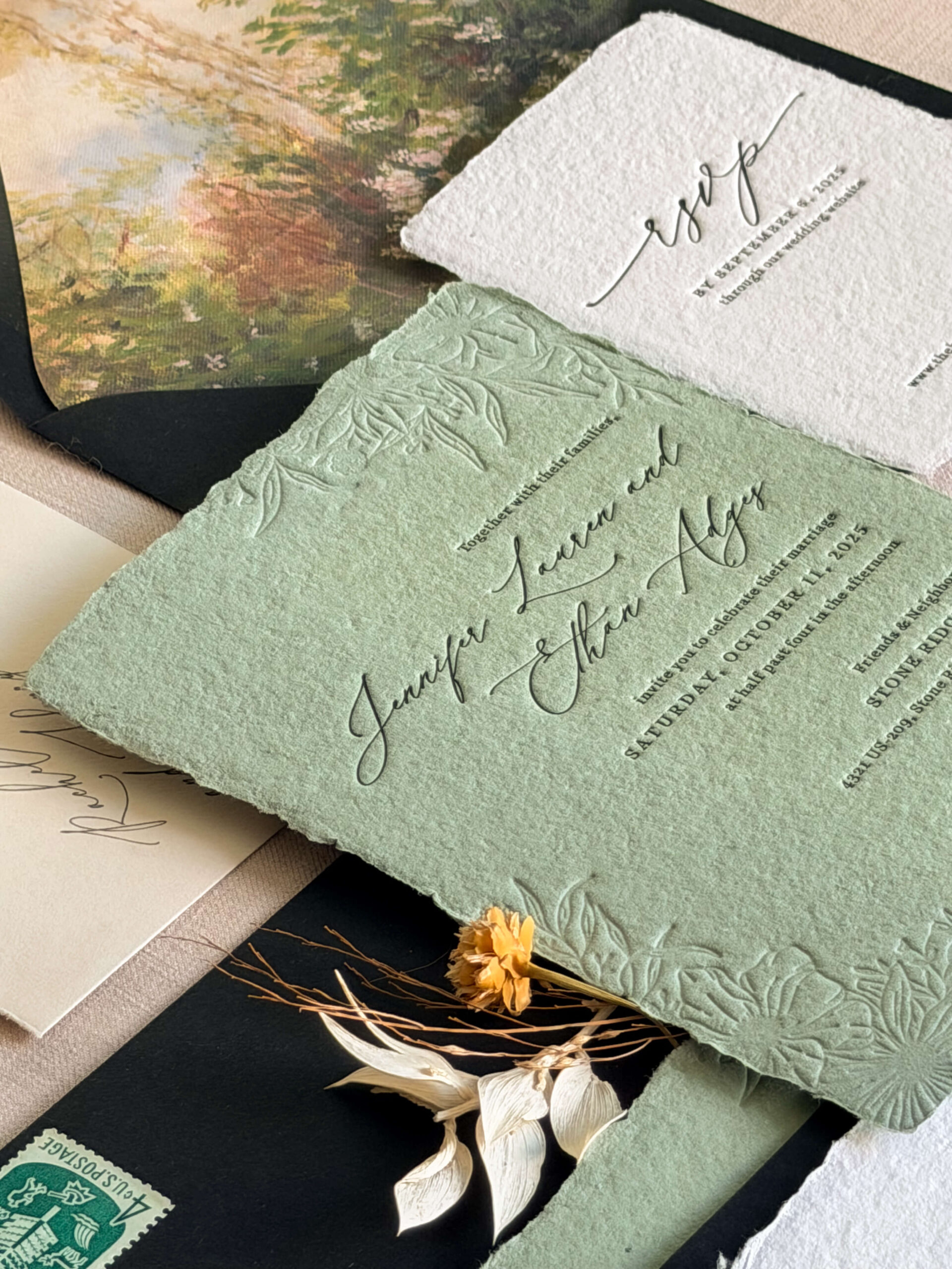
7. you don’t have to use white
White is classic for a reason, but it isn’t your only option.
If you’re envisioning an elegant, neutral, black-tie wedding, for example, an ivory or champagne envelope paired with white or warm ivory paper can feel much softer and more dimensional than an entirely white suite.
The same goes for colored paper.
Sometimes the easiest way to introduce color isn’t through another ink color at all—it’s through the paper itself.
A soft blush card. A warm gray envelope. A muted green liner. A natural cotton paper.
Color doesn’t always need to be loud to make an impact.
8. your invitations don’t have to match your wedding perfectly
This might be the most freeing piece of advice I can give you.
Your invitations do not need to match your wedding day exactly.
They’re the introduction.
They should give your guests a sense of what’s to come, but they don’t need to contain every single detail they’ll eventually see.
If your wedding day has seven colors, your invitation might use three.
If your florals are wildly colorful, your invitation might be almost entirely neutral.
If your tablescape is maximalist, your stationery might be simple and restrained.
What matters is that they feel like they belong to the same world.
Think of your invitation as the first chapter—not the entire story.
the takeaway: edit, don’t add
When you’re struggling with your invitation colors, your first instinct might be to add another color.
Instead, try taking one away.
Look at your palette and ask yourself:
What are the two or three colors that really tell the story?
Then let everything else support those colors rather than compete with them.
And if you’re still unsure, send your mood board to your stationer. That’s exactly what we’re here for.
A thoughtful, edited palette will almost always feel more intentional than trying to fit your entire wedding color scheme onto a handful of cards.
Your wedding can have eight colors. Your invitations don’t need eight colors to tell the story.
Want to see some invitations in person to get inspired? You can order samples of my designs here.
featured posts
Showit Website Design by With Grace and Gold | Images Courtesy of grace and ardor