


What Is Letterpress Printing? Everything You Need to Know Before Ordering Wedding Invitations
March 23, 2026
published on
filed under
If you’ve been searching for wedding invitations and keep seeing the word letterpress, you’re probably wondering: what does that actually mean, and is it worth it?
The short answer is yes—but let me explain why, because once you understand what’s happening when a letterpress invitation is made, you’ll feel the difference every time you hold one.
what is letterpress printing?
At its most basic: letterpress is the process of pressing a raised, inked surface into paper.
Think of it like a very refined stamp—one with a precise, automatic inking system that ensures the design is inked perfectly with every pass. The result is a print that doesn’t just sit on top of the paper. It becomes part of it.
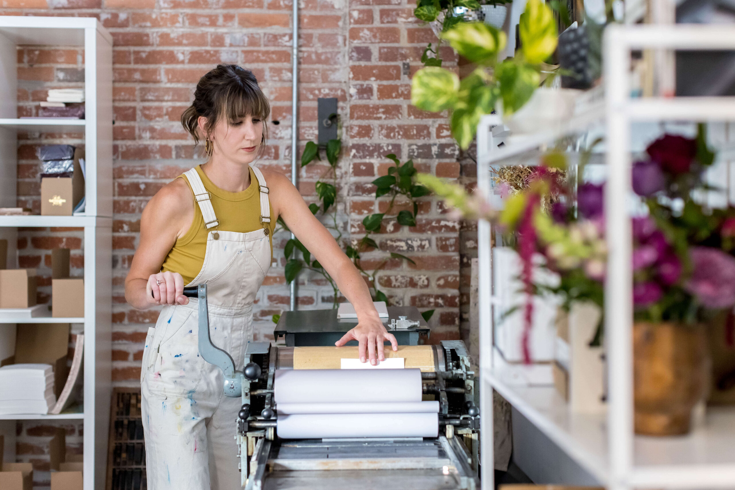
This is a printing technique that dates back to 1455, when Johann Gutenberg introduced movable type. What was once done letter by letter by hand is now done with photopolymer plates—but the press itself, the ink, the handmade paper, and the person feeding each sheet through by hand? That part hasn’t changed much.
how is letterpress different from digital printing?
This is the question worth spending a moment on, because the difference isn’t just visual—it’s tactile, and tactile is everything when it comes to wedding invitations.
Digital printing applies ink on top of paper using a process similar to a high-end inkjet or laser printer. It’s fast, affordable, and reproduces photographs and complex gradients beautifully. But the ink sits on the surface of the paper. It doesn’t interact with it.
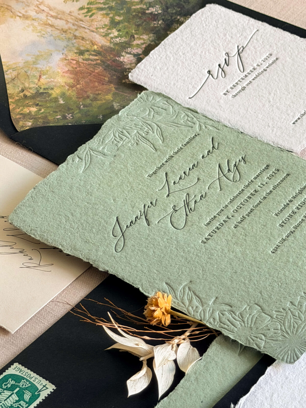
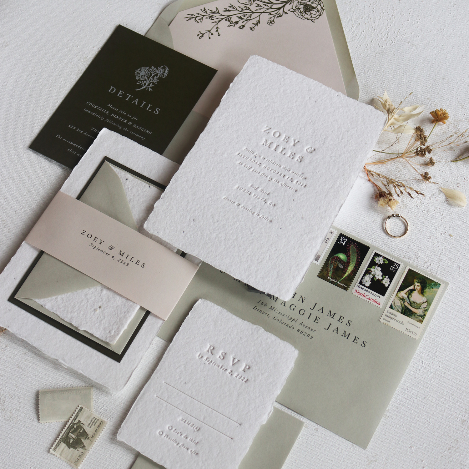
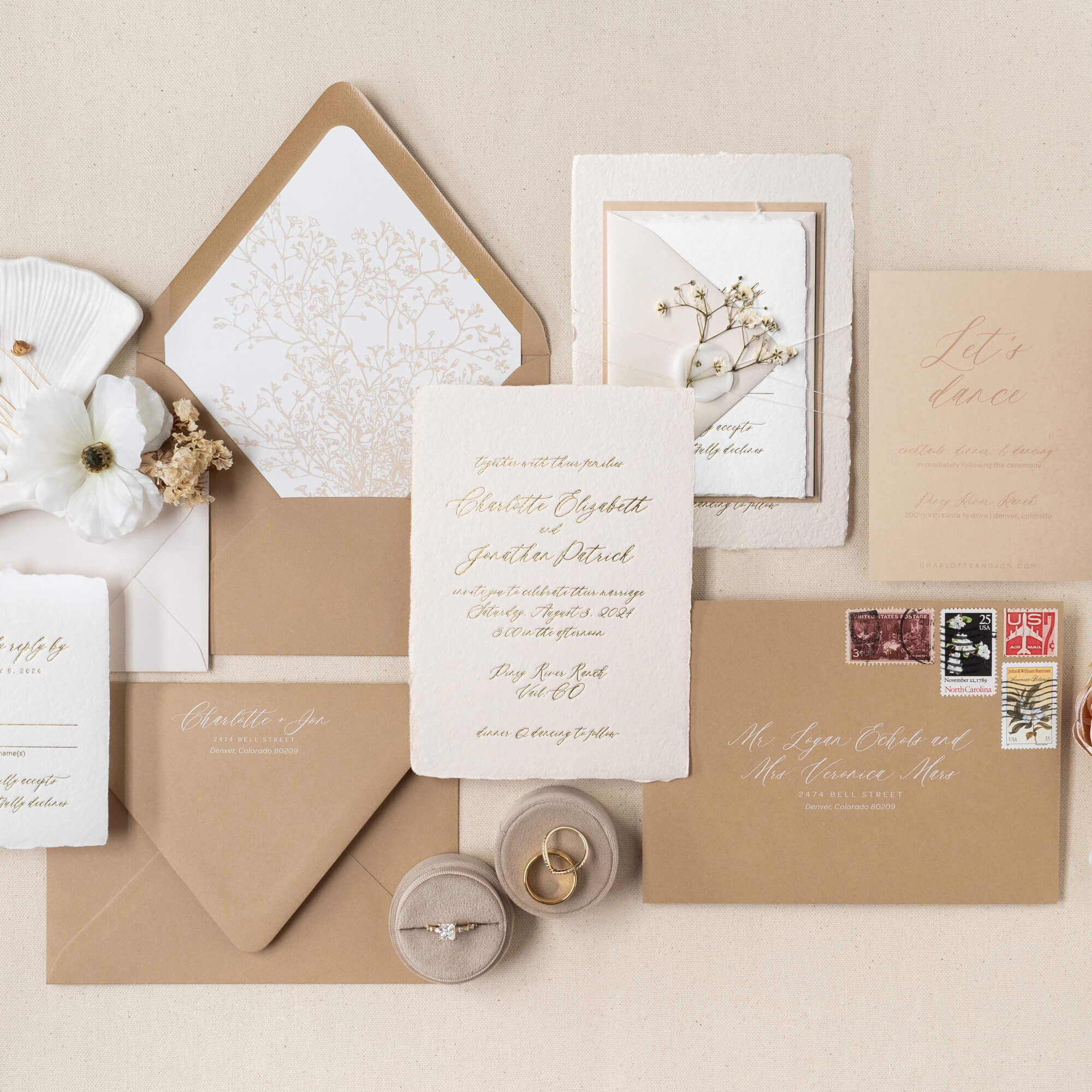
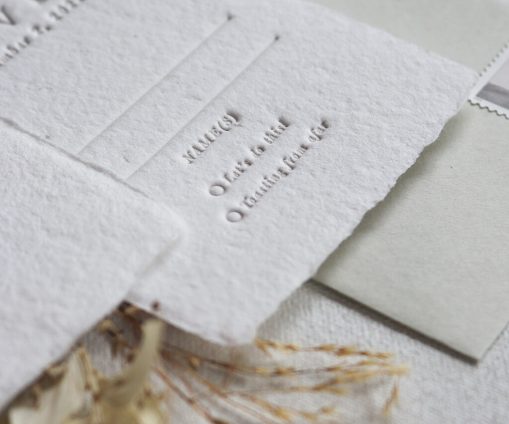
Letterpress printing presses ink into the paper with physical force. The design leaves an impression—a literal indentation—that you can see and feel. When your guests open the envelope, they’ll run their fingers over the card before they even read the words.
For a wedding invitation, that tactile moment matters. It signals, without saying anything, that what they’re holding took time and care to make.
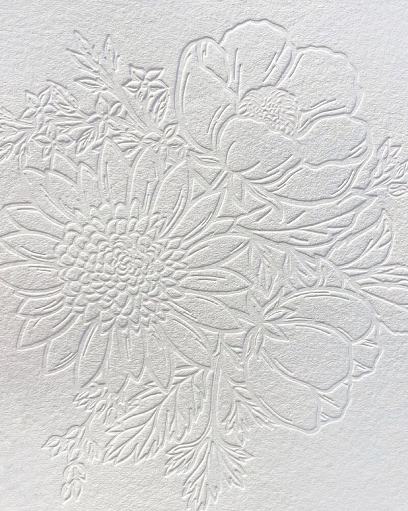
the impression: what makes letterpress invitations feel the way they do
The impression is the defining characteristic of a letterpress invitation—and the thing that’s almost impossible to capture in a photo.
It’s the indentation left by the design pressing into the paper. Deeper impressions feel more dramatic and bold. Lighter impressions read as soft and refined. The depth is something I control during printing by adjusting the packing underneath the sheet—it’s a craft decision, made one print at a time.
On a thick, handmade paper (like what I use at Terra Paper), that impression becomes something close to sculptural. You’re not looking at a flat image. You’re looking at something made.
how colors work in letterpress printing
Because of the way letterpress inking systems work, you can only print one color at a time. Each color requires a separate pass through the press: print the first color, clean the press completely, set up the second, and run it again.
This is why multi-color letterpress invitations take longer and cost more than single-color—each additional color is essentially a separate print job.
Here’s something most people don’t know: letterpress ink is transparent. That means anywhere two colors overlap, they mix. Print yellow first, then pink, and you’ll get orange wherever they cross. It’s something I work with intentionally in multi-color designs—it’s a way of building complexity and depth from just two or three inks.
For wedding invitations, a single carefully chosen ink color on the right paper is often all you need. The impression carries most of the weight.
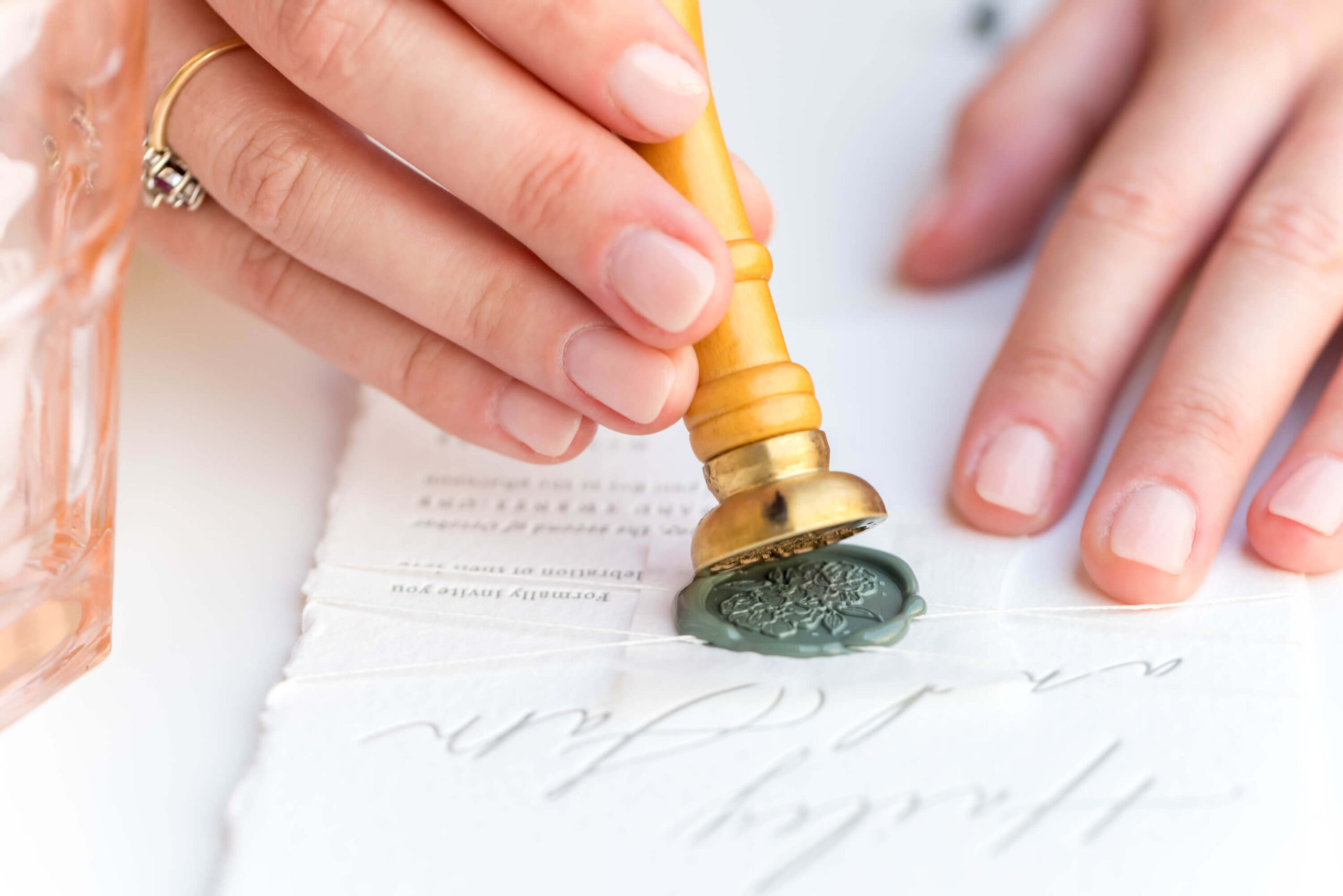
foil printing: the metallic alternative
Foil printing is a close cousin to letterpress. Instead of ink, a metallic or pigmented foil is pressed onto the paper using heat and a custom die. The result is that mirror-bright, reflective shine you see on invitations with gold or silver accents.
Foil and letterpress can also be combined—letterpress for the main text, foil for a monogram or floral detail—to create something that feels genuinely luxurious without going overboard.
At Terra Paper, I offer both letterpress and foil printing depending on the design and the look you’re going for.
blind embossing & debossing: the no-ink options
Both of these techniques use the same letterpress pressure—no ink involved. What changes is the direction of the impression.
A deboss presses the design into the paper, creating an indentation you can see and feel below the surface. An emboss does the opposite, raising the design above the paper so it stands in relief.
The effect in both cases is pure texture—your design rendered in shadow and dimension rather than color. It’s one of the quieter choices you can make with letterpress, and often one of the most elegant. A blind-embossed floral in the corner of an invitation, paired with a single deep ink color for the text, is the kind of detail that makes people look twice.
I’ll let the photos speak for themselves here.
how letterpress plates are made
This part often surprises people: letterpress today doesn’t require hand-set metal type. Modern letterpress printers (including me) use photopolymer plates—a semi-flexible plastic plate made using UV light exposure.
The design is created digitally, then sent to a plate maker as a high-contrast file. The plate maker exposes it using light through a negative, which hardens the raised areas of the plate. Those raised surfaces are what carry the ink and press into the paper.
The plates are also recyclable, which matters when you’re building a studio around sustainability.
is letterpress right for your wedding invitations?
Letterpress invitations aren’t the right fit for every couple—and I’d rather be upfront about that than oversell it.
Letterpress is a great fit if:
- You want something that feels as significant as the occasion
- You’re drawn to tactile, handmade quality
- You want an invitation your guests will actually keep
- Sustainability matters to you (especially paired with handmade, eco-friendly paper)
- You have a guest count of 20 or more (letterpress setup involves upfront time and materials that make very small quantities impractical)
Digital printing may be a better fit if:
- You need full-color photography or complex gradients in your design
- You’re working with a very small guest count or a tight budget
- You need a very fast turnaround with no flexibility
Can’t decide? You don’t have to choose just one.
A lot of couples opt for simple digital save the dates—something clean, affordable, and easy to send early—then go all out on letterpress invitations when the big moment arrives. It’s a smart way to keep your overall stationery budget in check without sacrificing the thing your guests will actually hold onto. The save the date is a heads up. The invitation is the experience.
experience letterpress for yourself
Every invitation I make at Terra Paper is printed by hand on my antique letterpress press, on handmade paper with natural deckled edges. Some designs are available on seeded paper that can be planted after the wedding to grow wildflowers.
If you’ve never held a letterpress invitation before, I’d love to change that.
ORDER A SAMPLE | EXPLORE INVITATION DESIGNS
featured posts
Showit Website Design by With Grace and Gold | Images Courtesy of grace and ardor